The battle of RGB vs CMYK - which should you pick and why
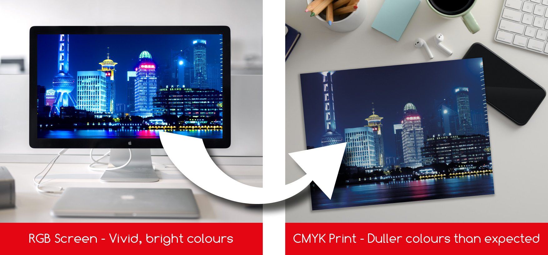
So you sent your printing company (hopefully us) an amazing bright vivid piece of artwork and it's come back printed duller.... What happened?
"Hold on, I've seen flyers come through my letterbox with illuminous printed colours"
Well this is because they've printed them using CMYK plus a spot colour.
Woah! What's a spot colour?
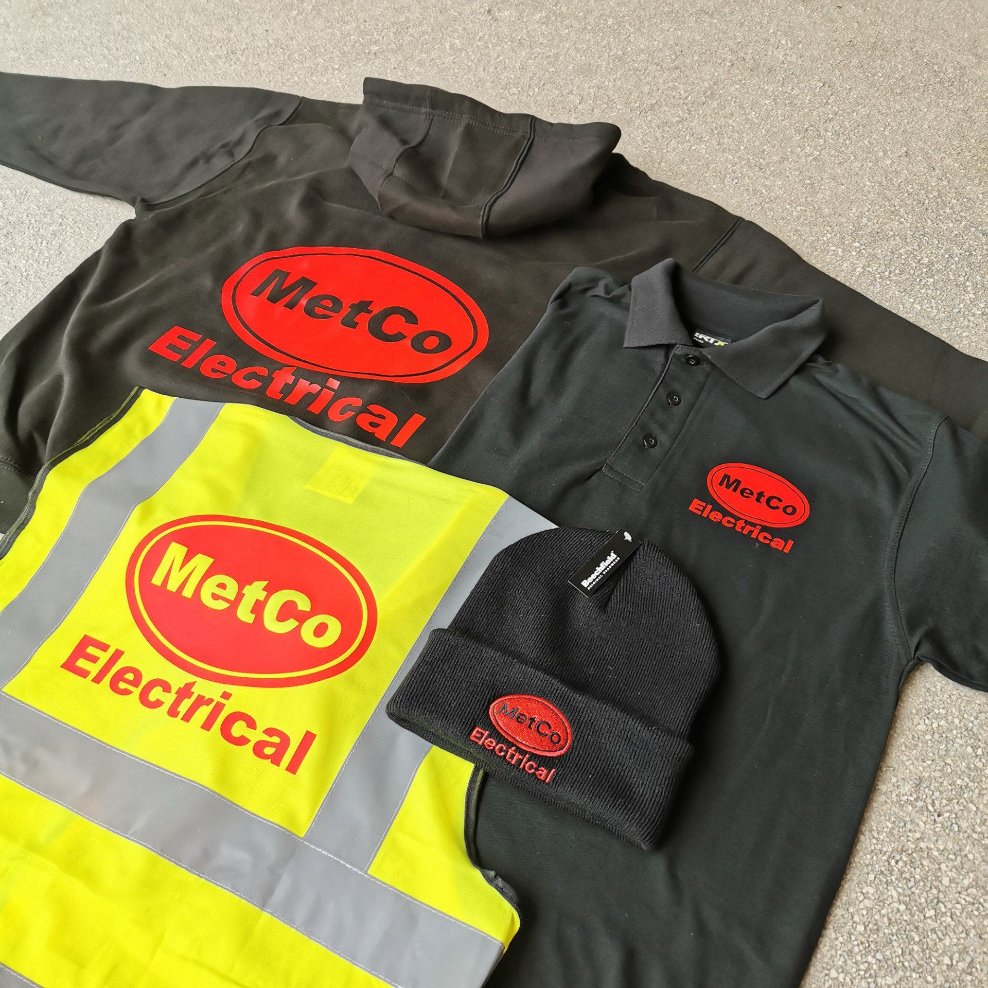
A spot colour is a ready mixed ink commonly named Pantone colours. PANTONE colours are a huge colour library of pre mixed inks - and yes, you can then have vivid, illuminous or even metallic colours. But these then come at an extra cost and are only cost effective if you are having large print runs. They do have fantastic finished print results though, so get in touch if you'd like to discuss these further.
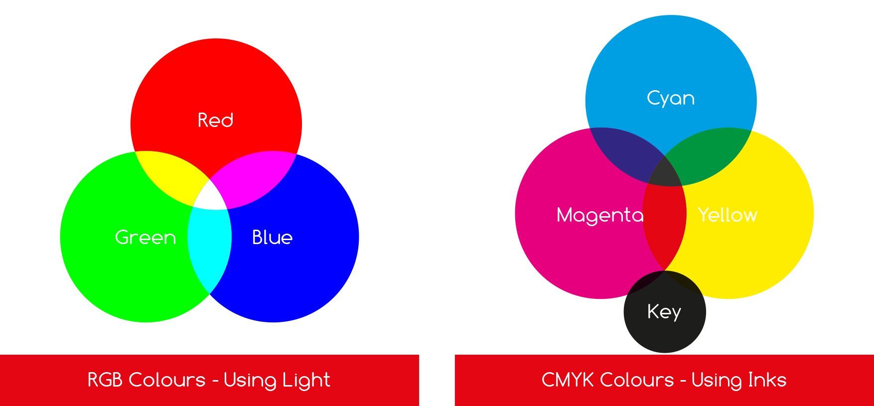
What happens if I forget and send my artwork in RGB?
We always check the artwork when we start preparing it for print and if there's RGB then we will convert it to CMYK for you. This is all done before we send your proof.... So if your proof arrives in your mailbox and you think it looks duller than what you sent, that'll be why.
Although, bear in mind, an electronic PDF proof viewed on your screen still isn't colour accurate to how it will print (due to the light of the screen again). Although once we've converted any RGB to CMYK it will be a closer representation.
So always create your print artwork set up in CMYK colour mode. This way you won't be disappointed and will be seeing more realistic colour results to what you'll get with your printed leaflets, posters or roller banners etc.
If you need any further assistance with setting up your
artwork then please don't hesitate to ask for our advice.
Call 07824 806299 or email print@abovethebelow.co.uk
CLICK HERE TO READ MORE ABOUT OUR DESIGN SERVICE